ok! seguros
Rethink a brand for the digital world? Of course, we said ok!
As a Portuguese insurance company, ok! is one of the brands with the most awareness in the market. WYcreative and Bliss worked as one to achieve the main goals of this brand transformation – to modernize and digitalize ok! – through a new positioning and identity, towards a more self-service approach, where each customer has its own tailor-made insurance.
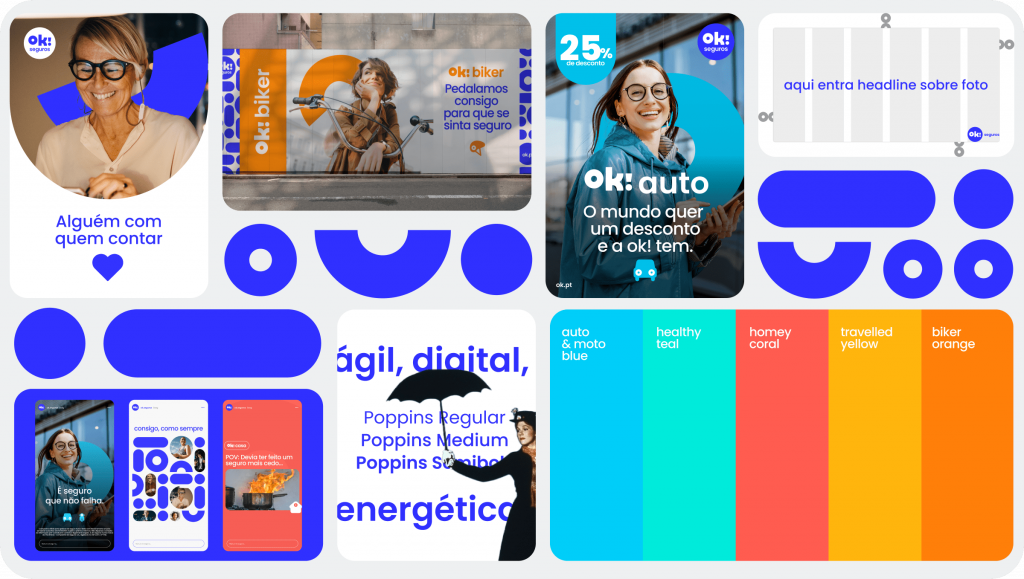
A true friend that you can count on
Human, energetic, positive, accessible, and close to their customers were the values that guided this transformation. We know that everyone wants a life without any fears or insecurities, which is why we created a storytelling that positions the brand as a true friend. Just imagine a friend who drives 3 hours at night just to pick you up – that’s ok!
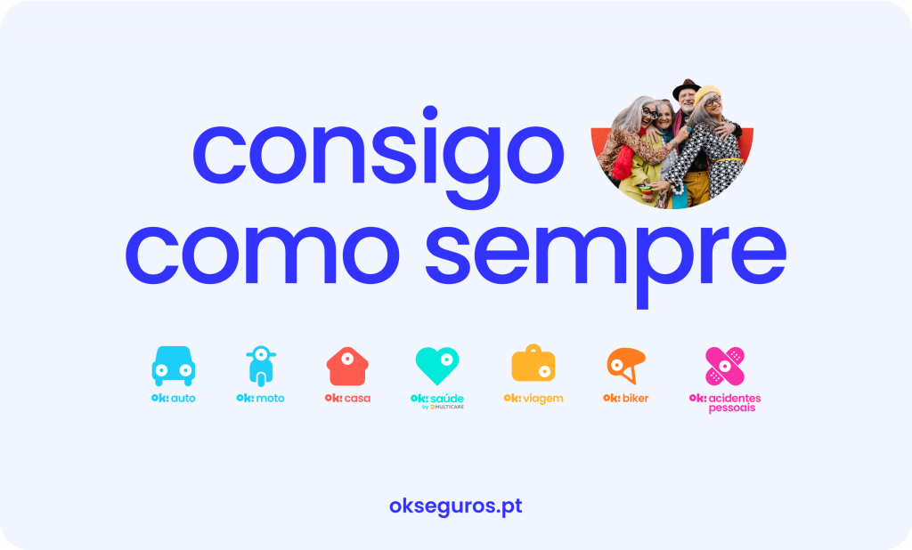
A new and dynamic visual identity
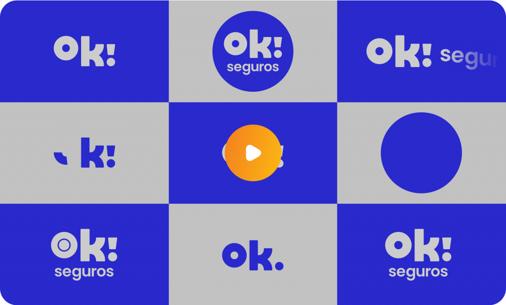
We started with a circle to represent security and the 360 offer. This rounded shape brings friendliness, and the lowercase conveys tranquility. We also developed some variations so we could have an adaptable and dynamic brand. Even the brand color was carefully thought out—a more digital blue called “friendly blue”.
Website: outstanding digital insurance experience
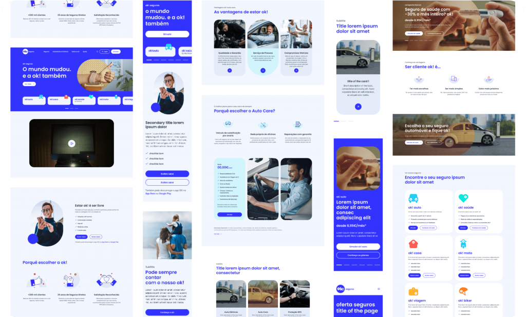
Bliss was challenged to revamp the company’s website so that it could match its new brand identity and logo and offer an excellent user experience while digitalizing the company’s key services. The focus was on streamlining the user experience with a UX and UI approach, which was accomplished by providing simple navigation and combining multiple insurance products, services, and compliance criteria. It is now easier to look at all the benefits, simulate them, and sign up for digital insurance.
